
Our regular interactions with the city include ongoing communication. We ponder things like "Where am I now?" "Where am I going?" "What am I looking for?" "What is this building for?" and "How do I experience this space" as we go through various settings. While spatial interactions may seem intuitive, environmental graphic design (EGD), which acts as a crucial interface between us and the built world, offers the solutions. It entails creating graphic components that blend with architectural, landscape, urban, and interior designs to enhance the informational value, usability, and memorable quality of locations. The three main components of EDG are text, form, and color. Text Normally, colors and shapes encompass the graphic information, but color projects, amplifies, and aids in communicating it inside congested metropolitan settings. Since our senses primarily register visual impressions, we first perceive colors in spatial encounters. In order to give a layered experience of identification images, feeling of place, and emotional connection, environmental graphics must strategically use color. The graphic information is normally encapsulated in text and shapes, but color projects it, intensify it, and aids in communicating it amid crowded metropolitan settings. Since our senses primarily register visual impressions, we first perceive colors in spatial encounters. In order to give a layered experience of identification images, feeling of place, and emotional connection, environmental graphics must strategically use color.
Egyptian hieroglyphics, which overlaid stories on buildings as a historical record for the culture, are one of the earliest examples of incising graphical text on architecture. Environmental graphic design has expanded to include more than just storytelling in recent years. It is evident on billboards, traffic signs, mailboxes, public art projects, and other urban experience places, graphically expressing how complex societies function. All of these can be conveyed through color, which acts as a facade and influences perception directly. In addition to layering information in a pleasing and attractive way, color also produces a sense of coherence, soothes psychological tension, lessens anxiety in large-scale structures, and establishes order in urban settings.

In graphic design, some hues are known to elicit particular emotional reactions. Strong feelings like passion, enthusiasm, and urgency are evoked by the color red. The color blue is frequently linked to serenity, reliability, and trust. Yellow stands for joy, vigor, and optimism. Purple is a symbol of luxury, creativity, and spirituality, whereas green is mostly a representation of nature and can signify health, harmony, and balance. Information may be perceived while also evoking an emotional response by carefully mixing these colors with the style of the city and its existing structures. In hospital designs, for instance, the usage of green and yellow graphic elements on white interior surfaces is frequently done to ease patient worry and enhance general well-being.
The effectiveness of thematic coloring and design in calming young patients has also been shown in recent research on the impact of color coding on ambient graphic design in children's hospitals. By using a uniform design and color-coded theme, the authors Asri Dwiputri and Wirania Swasty suggest that all signage in a certain section can be connected. This might include employing a blue ocean theme for one level, a green forest theme for one department that serves outpatients, or a yellow desert theme for one that serves intensive care patients. This strategy uses color in environmental graphic design to create more calming, less intimidating environments.

In order to help people find their way through a town or city, way-finding systems are often designed using color as a strategic element. It is employed to edit the visual hierarchy of messages, determining what visitors should initially see and then read. A hierarchy of how the message should be viewed, for instance, can be reflected by projecting the location's location in warm hues and the title of the location in brilliant colors. This is utilized to efficiently guide passengers in complicated locations like train stations, airports, and stadiums, together with size, scale, and typography.

Additionally, while creating such structures, the selection of a sign's hue is influenced by the visual surroundings, such as the background colors of the walls and windows, the quantity of daylight present, the lighting, and other architectural features. The use of contrast to make signs easier to read is common in visually busy areas like airports. This includes everything from the distinct color contrast between the letters' background and the signage to the distinction between the signage and its surrounding visual environment.
.jpg)
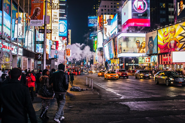
In the city, where there are many visual collections of various buildings housing signs, and advertisements, the choice of color becomes more complicated. For instance, Times Square in Midtown Manhattan is a well-known commercial junction that is distinguished by numerous layers of color contrast in environmental graphic design. The strategic decision for new signs in the region is based on how adjacent buildings appear to the eye, the color scheme of the graphics they portray, and how the new color contrasts with the background color.
Additionally, Times Square demonstrates how environmental graphic design (EDG)'s use of a color-collage adds to placemaking. A place can be radically transformed by the use of color in conjunction with fonts, patterns, and animation, giving offices, dining establishments, malls, and other distinctive urban locations personality. A feeling of identity can be developed with the inhabitants by utilizing the emotive qualities of color to tell stories in graphics or produce visuals that connect with a community.
Graffiti is a well-known illustration of how color shapes urban spaces. Graffiti uses color to express self, display socio-cultural tensions, and stake a claim to a specific location on city walls. Graffiti that uses a straightforward color palette draws attention to the geometric shapes. Meanwhile, swirls of vivid primary hues pulsate and seem to dance with incredible vitality. Graffiti's clever use of color in environmental graphics is intended to evoke strong feelings in viewers and make the art stick in their minds.

Color usage is crucial in many facets of environmental graphics. It has an impact on people's ability to move across space, engage with others, and sense of belonging. The strategic use of color is used to create better wayfinding systems, exhibitions, public installations, and distinctive locations in the city through features including visual hierarchy, emotional perception, contrast, identification, and other aspects of color theory. Our visual communication with color creates a fundamental layer of environmental graphic design that shapes our experiences as we explore various facets of the city.
"Where art and information seamlessly blend with the world around us"
A greener path to a sustainable future...
Maximizing
Amazon
Success


.jpg)


Comments
Post a Comment
Thank you so much for your kind words! I'm thrilled to hear that you found the article informative and that it helped you learn more about the topic. Your feedback truly encourages me to continue sharing my knowledge. If you have any questions or would like to delve deeper into any aspect, feel free to reach out. Thanks again for your support!